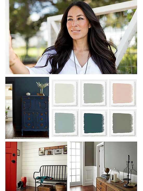
1. Muted Pastels
This year, Joanna plans to incorporate a few color families into her projects. She says she’s not typically one to follow trends and usually opts for tried-and-true hues that will stand the test of time.
“I’m a big believer in mixing classic palettes with more-modern, meaningful accent pieces that make the homes we work on feel personalized and authentic to the family who will gather in them,” she says.
According to Joanna, muted pastels are having a moment right now.
“Delicate muted pinks, blues, and yellows evoke a comfortable feeling when paired with warm neutrals and soft textures,” she says.
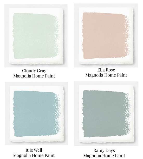
Muted pastels like Rainy Days and Ella Rose work as gentle pops of color in an entryway or bedroom. Joanna says she also loves a color called It Is Well, a muted sky blue, that looks fantastic on decor painted with her Chalk Style Paint.
2. Nod to Nature
Colors inspired by nature are also on Joanna’s radar in 2018.
“Yellows, browns, and greens feel like home to me,” she says. “Earth tones pair so well with fresh florals and rustic accents, and you’ll see a lot of these colors reflected in our first Hearth & Hand by Magnolia collection at Target.”
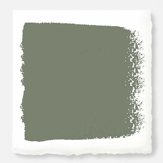
Her favorite nature-inspired colors are earthy greens, such as Olive Grove (pictured above), a peaceful botanical green, and Garden Trowel, a neutral gray with hints of olive green and cocoa.
3. No-Fail Color
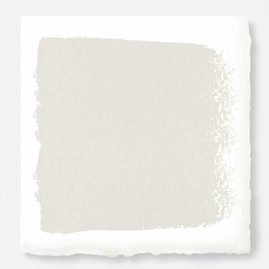
We were curious to find out what Joanna’s go-to color is—what color she can count on to look beautiful in a variety of lighting situations. She told us she loves incorporating bold, colorful hues in her projects, but she can always count on Shiplap (pictured above), a creamy, neutral white from the Magnolia Home Paint collection with KILZ, to create a bright, clean, and versatile backdrop for decor.
“It’s my belief that the most beautiful neutrals are soft, timeless, and subtle enough to let your family’s story and special belongings really shine within the space,” she says. “You have to be mindful when choosing whites, especially if there isn’t much natural light, but Shiplap has enough pigment to work in any space or lighting situation. You simply can’t go wrong!”
4. Wonderful in White
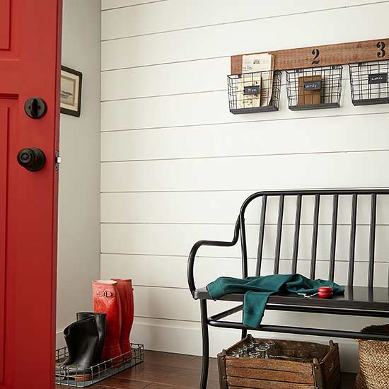
White walls and cabinetry continue to be popular this year, but we wondered if the white trend will continue beyond 2018. According to Joanna, not only can we expect to see more white, but also white in warmer shades.
“As everyone knows by now, I have an affinity for white shiplap—and any white finish for that matter!” she says. “In my mind, neutral never goes out of style. 2017 was filled with bright, almost translucent whites, but I think we’ll be seeing things trend toward warmer shades in the new year.”
She says 2018 will be all about contrast, and she’ll continue using Shiplap or True White paired with inspiring patterns and textured finishes.
Nothing says bright and fresh like white. See our favorite ideas for decorating with white.
5. Dark Moody Hues
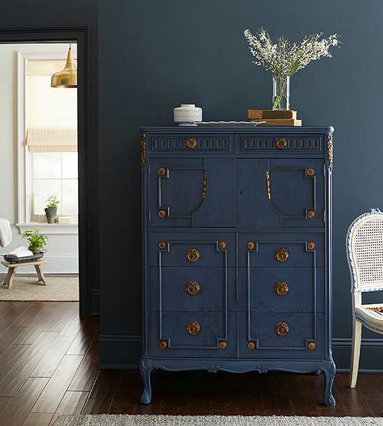
Dark rich colors, like black, navy, and chestnut brown, continue to be popular accent colors. So which cozy deep colors currently inspire Joanna?
“I’m drawn to deep, moody hues right now, especially blues and greens,” she says.
With so many variations, including inky indigo, classic navy, and eye-catching turquoise, anyone can find a shade that fits their own style. What’s more, they can be pulled into almost any color scheme, whether it’s through throw pillows, a beautiful print, or a statement furniture piece painted with her Chalk Style Paint.
“Dark doesn’t have to mean scary,” she says.
6. Bold Statement Colors
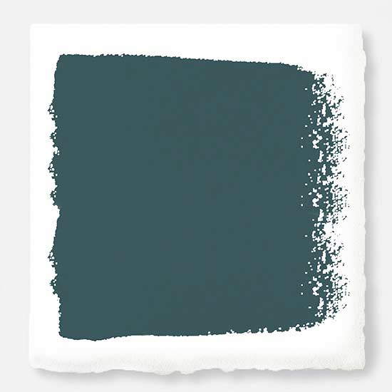
Over the past few years, consumers have mostly stayed neutral when it comes to paint colors, but lately we’re seeing signs of bolder and brighter wall colors in interior design.
“People often associate my style with whites, grays and neutrals,” Joanna says, “but I also really appreciate bold statement colors that can add energy and life to a room.”
Joanna’s favorite statement color right now is a shade called Weekend (pictured above). Weekend is a vibrant, denim-inspired blue from her paint collection that always puts her at ease.
“Like the weekends, this shade of blue is calm and relaxing—a sort of color retreat, if you will,” she says.
7. Color Picks for Painted Furniture
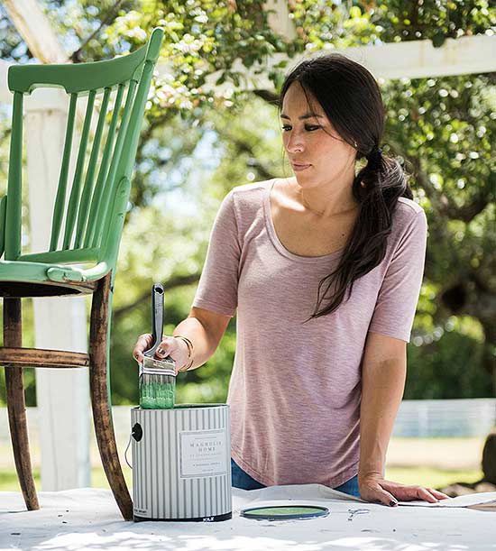
We love Joanna’s Magnolia Home Chalk Style Paint for furniture and accessories, and we asked her which colors from the line she’s most excited to use for furniture transformations this year. In addition to the blue shade It Is Well mentioned earlier, she says One Horn White has a light beige tint that’s warm, welcoming, and fantastic on furniture.
These are great ideas to spruce up your home this spring! I’f you’re wondering how to get the most bang out of your buck for remodels or finish selections, I’d be happy to give my two cents.
Photo Source:
Article Source: bhg.com