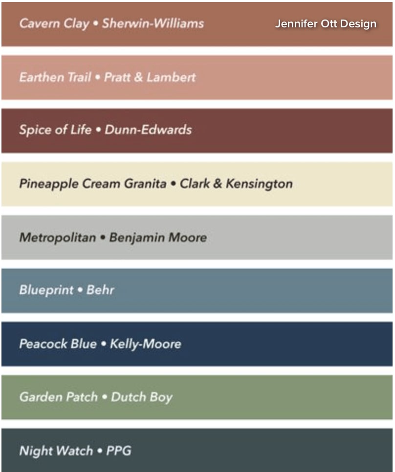
The experts say these are going to be the biggest colors for 2019! A couple of my personal favorites on this list are Blueprint and Night Watch, but overall the colors here are big, bold and full of personality. Drumroll….here are the house paint colors that will dominate in 2019. Thanks to our friends over at Houzz for compiling this list.
As 2018 winds down and we turn our attention to the new year, it’s time to take a look at color trends on the horizon. This year’s batch of Color of the Year selections for 2019 from the various paint company brands runs the gamut from warm terra cottas to moody cool hues.
by Jennifer Ott Design
Unlike Pantone’s pick of Living Coral, none of these nine paint colors are mega bright, which makes them way more home decor-friendly. In fact, I have to say that these are the moodiest colors I’ve ever seen chosen for Color of the Year. Perhaps it’s a signal that 2019 will be a year of introspection and reflection.
Let’s take a look at each Color of the Year selection for 2019 in detail.
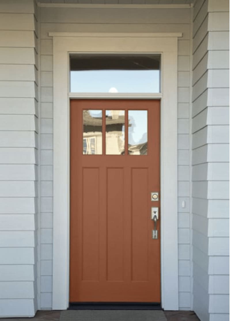
1. Cavern Clay From Sherwin-Williams
Going for a “desert modern” vibe, Sherwin-Williams touts this color as midcentury modern meets American Southwest.
Cavern Clay from Sherwin-Williams
Cavern Clay certainly calls to mind the beautiful terra-cotta hues found in the Southwest, but it can be a tricky color to bring into the home due to its muddiness. Using pure white or black colors as a contrast, rather than dark tans or browns, will give it a clean look.
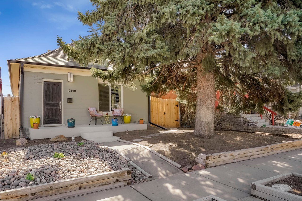
If you’re a fan of this color, consider using it in a bedroom or dining room, spaces in which a warm, cozy and nurturing atmosphere is desired. I also like it as a front door color, especially against a neutral, light and crisp house color. It’s welcoming and calls attention to a home’s entrance without coming on too strong.
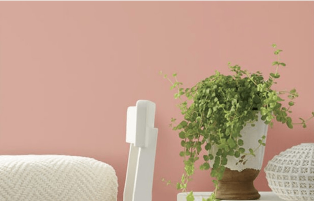
2. Earthen Trail From Pratt & Lambert
Seemingly on the same page as Pantone, this selection from Pratt & Lambert is a softer, calmer version of Pantone’s Living Coral. Given the similarity to Pantone’s Color of the Year, I imagine it will be a popular color in home decor in the coming months. If you dig this pink-orange hybrid, 2019 will be a good year for you to pick up items for your home in the color.
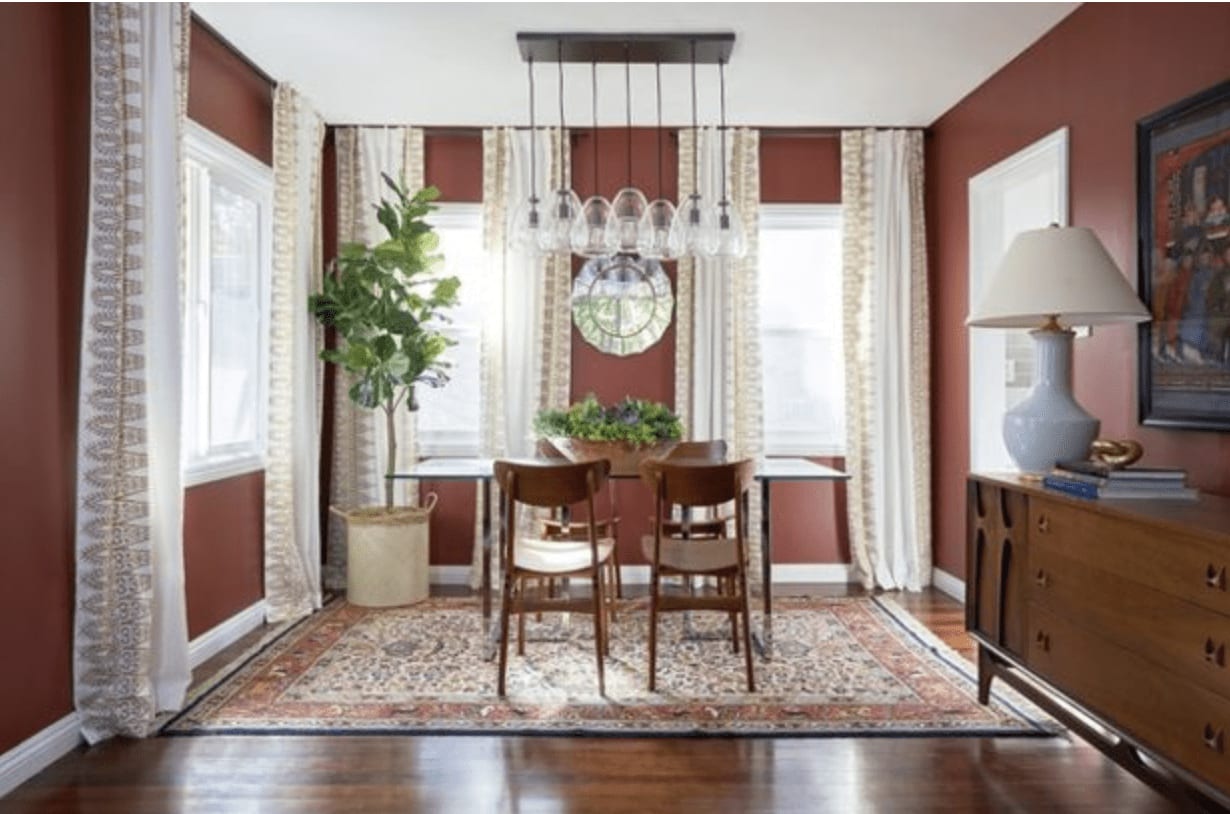
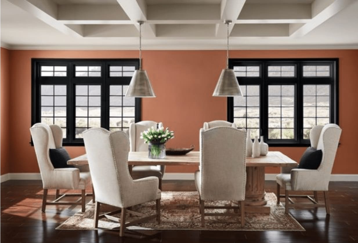
3. Spice of Life From Dunn-Edwards
Personally I prefer warm colors that have more oomph and drama to them, which is why Spice of Life is my favorite of the warm picks for Color of the Year. This rich and spicy color has such welcoming warmth to it. It’s a great choice for your dining room because colors in the red family are thought to stimulate conversations and appetites.
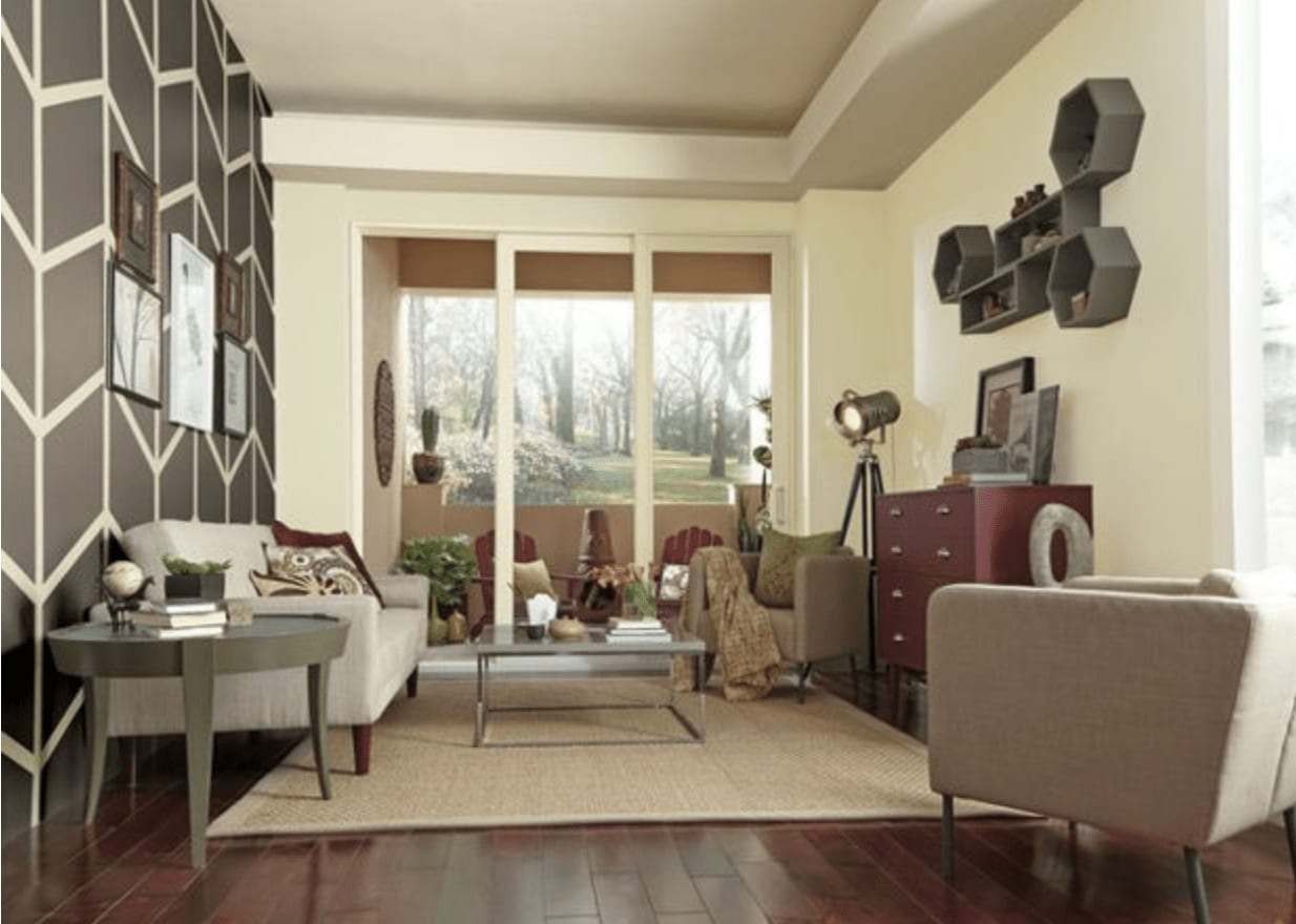
4. Pineapple Cream Granita From Clark & Kensington
One of the few light shades of the bunch, Pineapple Cream Granita is a super soft and muted yellow, shown on two walls here. It’s light and neutral enough that it can be used throughout a room or house, but I think it needs crisp white accents (such as on ceilings, doors and trim) to keep it from looking dingy.
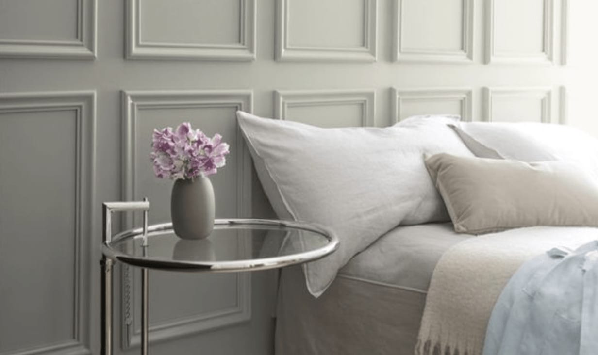
5. Metropolitan From Benjamin Moore
The other whisper-soft selection, Metropolitan, is one of those light gray colors that seems to constantly shift from gray to green to blue.
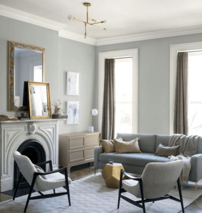
Metropolitan from Benjamin Moore
As you can see from these two different photos of it on the walls, the color changes depending on the light and other colors in the room. It’s a very adaptable hue, so you can work almost any other color in with it.
I also like this as an alternative to basic white, which is often used as a default color for all walls in a home. Metropolitan offers the slightest hint of color while remaining a quiet backdrop to other colors, textures and decorative elements in a room.
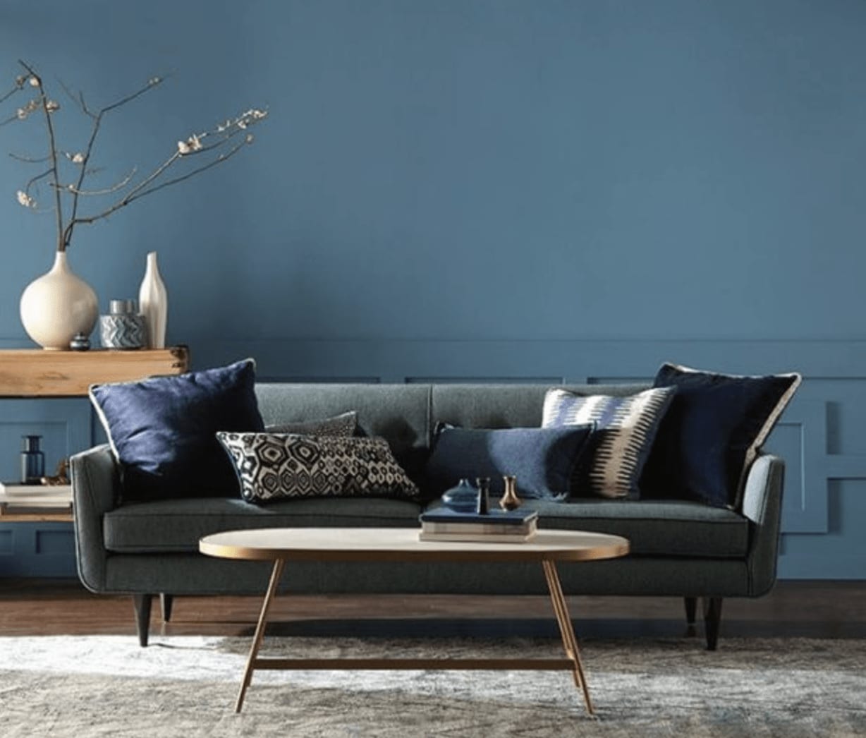
6. Blueprint From Behr
I really like Behr’s selection. Blueprint packs a punch without veering too dark or bold. It’s a good choice for those who crave a bit of drama in a room but still want to keep things fairly neutral. Blueprint has a healthy dose of gray in it, which is what gives it softness.
Use this hue in your bedroom or living room or whatever space you’ve deemed your chill-out zone. Just keep in mind that it might feel a bit too chilly in predominantly cold climates.

7. Peacock Blue From Kelly-Moore
If it’s drama you are looking for, Kelly-Moore has it for you with their selection for Color of the Year. Peacock Blue is a saturated, sophisticated color that works best in small doses. I think it’s a great alternative to black or dark gray, and I can see it working well on kitchen base cabinets or just the island.
If you want larger doses of it, think about pairing it with plenty of white or other cool light colors so it doesn’t feel too heavy and somber.
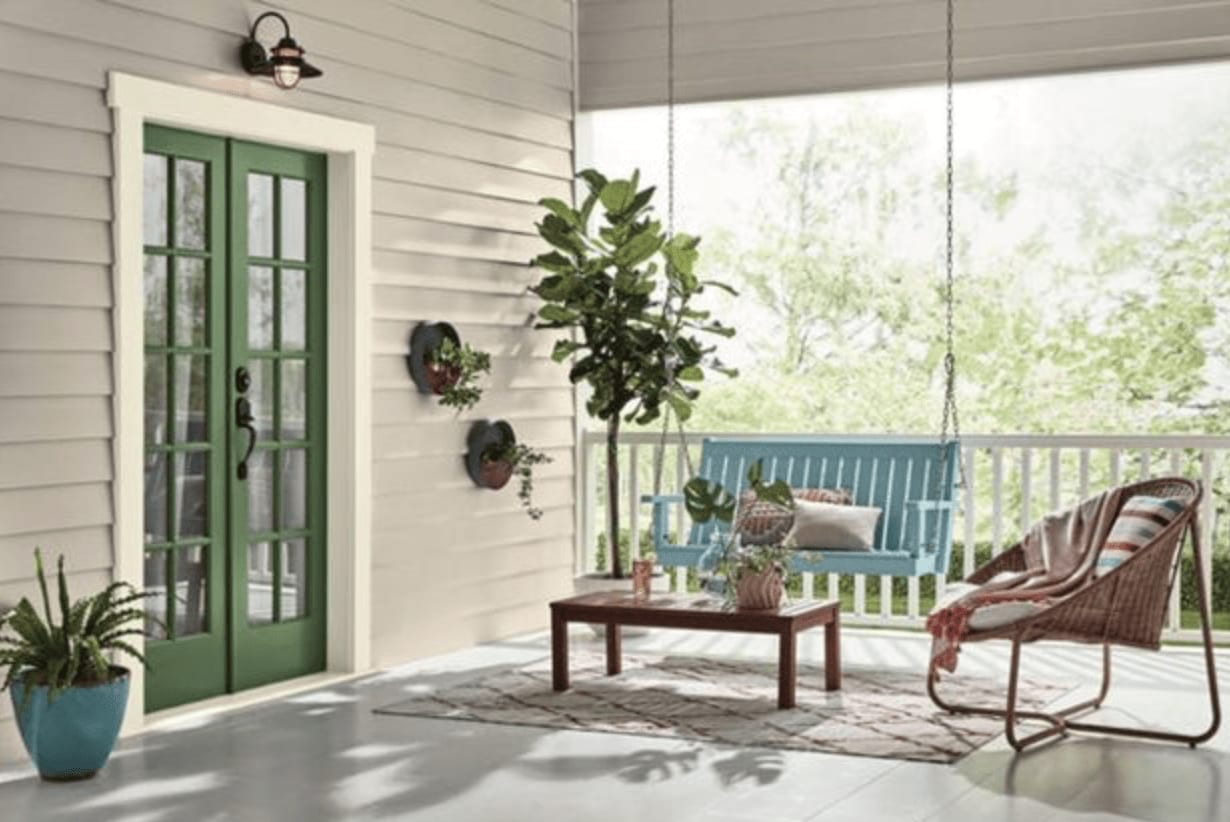
8. Garden Patch From Dutch Boy
I’ve never met a green hue I didn’t like, and Garden Patch is no exception. This grassy green color brings a nice nod to nature into your home. Or use this happy color on the outside as a friendly front door or trim color.
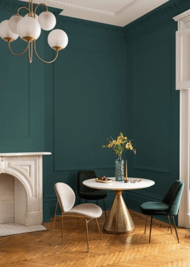
9. Night Watch From PPG
I’m also a big fan of this color, though it’s admittedly not an easy color to use for interiors. I think the trick to making Night Watch work is to use it in rooms that have plenty of natural light pouring in. I’d also limit the color palette so it doesn’t fight with too many other colors.
I’ve had great results using similar colors on the exterior of a home. As a siding color it’s an unusual alternative to the trendy dark gray and navy hues that have been popular house colors the past few years.
Your turn: Which color is your favorite? What other color do you think should be a contender for 2019 Color of the Year?