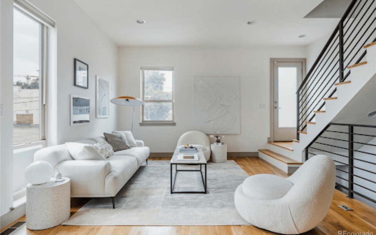
Color preferences vary as much as personalities. Some folks love the bright and the bold, while others feel most secure surrounded by neutrals. The good news is that when it comes to color, there really is no “correct” palette.
That said, we’ve all been inside homes where an explosion of color created a choppy feel between rooms — and sometimes, the urge to run. A great way to avoid this result is to hire a designer or color consultant, either to guide your entire remodeling or decorating project or simply to advise you on the best colors for your spaces. We asked pros to share their tips for creating a cohesive flow of color throughout a home. Read on to find out what they said.
1. Pick a Flow-Through Paint
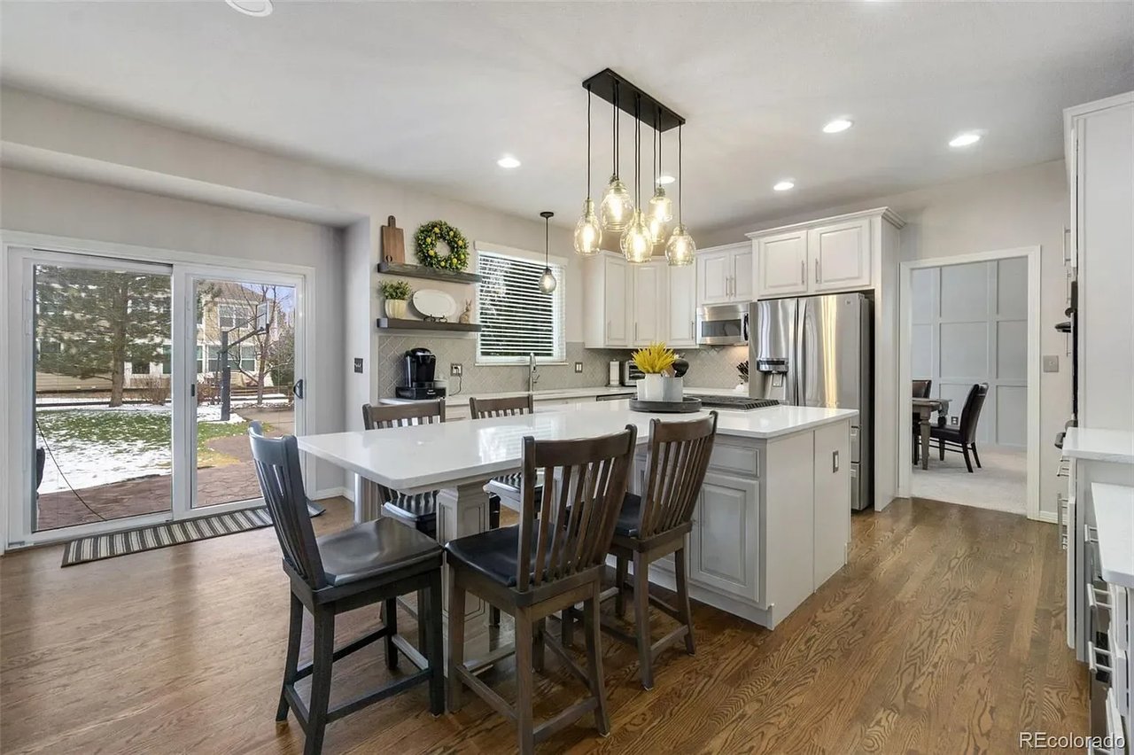
One simple way to create a cohesive feel is to use a consistent paint color on the walls of connecting spaces. “Particularly in homes that have more of an open floor plan, it’s best to choose one color that is going to serve as your main color or your neutral,” says Kelly Porter, an interior designer based in Washington, D.C. “That doesn’t mean it has to be beige or white or gray. But the foyer, the hallways and that main connector room should all be the same color because you want to have that dominant color in your space.”

2. Pay Attention to Sightlines
San Francisco interior designer and color expert Jennifer Ott frequently works with clients who want more variety in their wall colors. When that is the case, she suggests considering sightlines. When you’re standing in the living room, what other rooms will you see? If you have a view into the kitchen, the dining room and the foyer, then the colors for those spaces need to work well together. “It can start to look really wacky if you have a different color scheme in each room,” Ott says.
3. Choose Color Groups
One way to increase the likelihood that a color scheme flows from room to room is to limit yourself to colors in the same temperature family. “Some people will stick to a warm color palette — reds and oranges and yellows or a cool scheme — grays and greens and blues,” Ott says.
Another option, Ott says, is to select one or two colors and then use variations of it. If the main color is blue, you might select a gray-blue, a pure blue and a navy paint as you move from room to room. The same concept can be used for decorative accessories.
For wall paint, you can ask the paint store to create a “tint” of a particular color, perhaps knocking down the main color by 50 percent, which the mixer will do by adding white. “They can create a lighter or darker version of it,” Ott says. “That’s a good way to unite without putting the same color everywhere.”
“I also tell people if they’re going to do their wall in this color, go two or three shades lighter for your ceiling so it doesn’t look like a sore thumb because you painted it white,” says Keith Wardlaw of Plus Modern Design in Kansas City, Missouri.
Paint decks can also be a good inspiration source for finding colors that work well together.
4. Restrict the Edgiest Colors to Enclosed Rooms
Rooms out of the sightline of other rooms are good places for going wild. Master bedrooms, powder rooms, kids rooms and any other room encapsulated by four walls are great places to indulge, says Carl Mattison, an Atlanta-based designer.
“If you turn the corner and go into a little powder bathroom, which you don’t go in all the time, who cares? Paint it black!” It works, Mattison says, “because it’s its own little box.”
5. For Bold Colors, Use Accessories
Accessories are a less expensive way to introduce dramatic colors than purchasing a couch or rug in the same tone, and they’re also easier to swap out should you tire of a color. Limiting bold colors to accessories also helps you avoid the shocking effect that can happen when a dramatic shade is painted on all four walls. “The key is finding a way to inject the color that makes rooms interesting and exciting without feeling like you need to escape,” Ott says. Bright color is good when you want to highlight a piece worthy of notice.
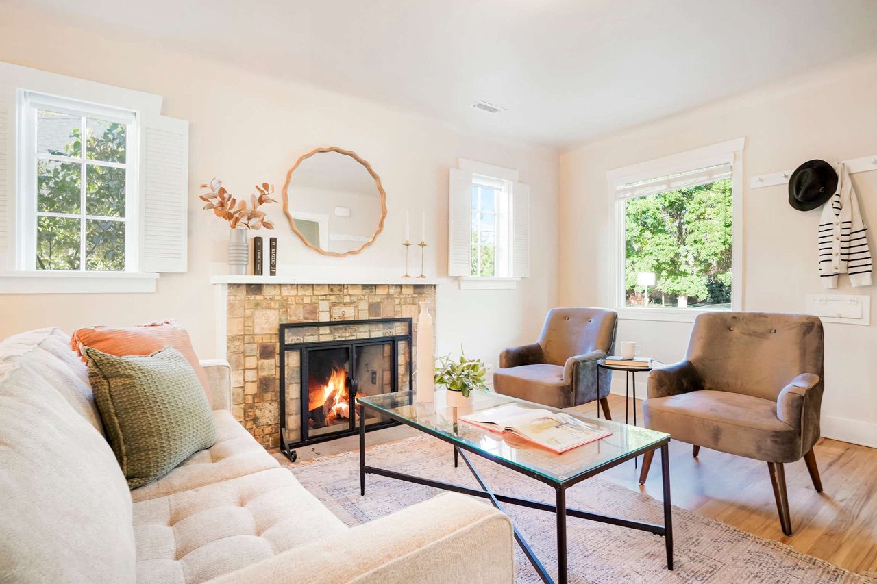
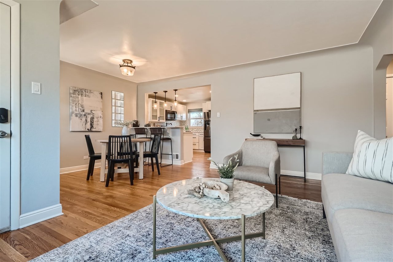
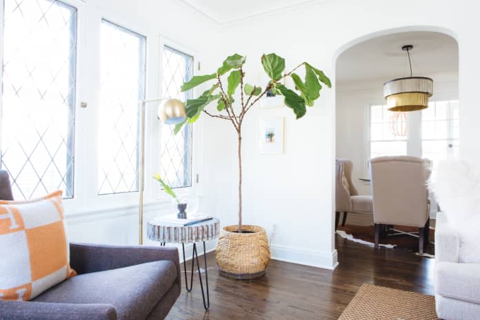
6. Tie Rooms Together With Accents
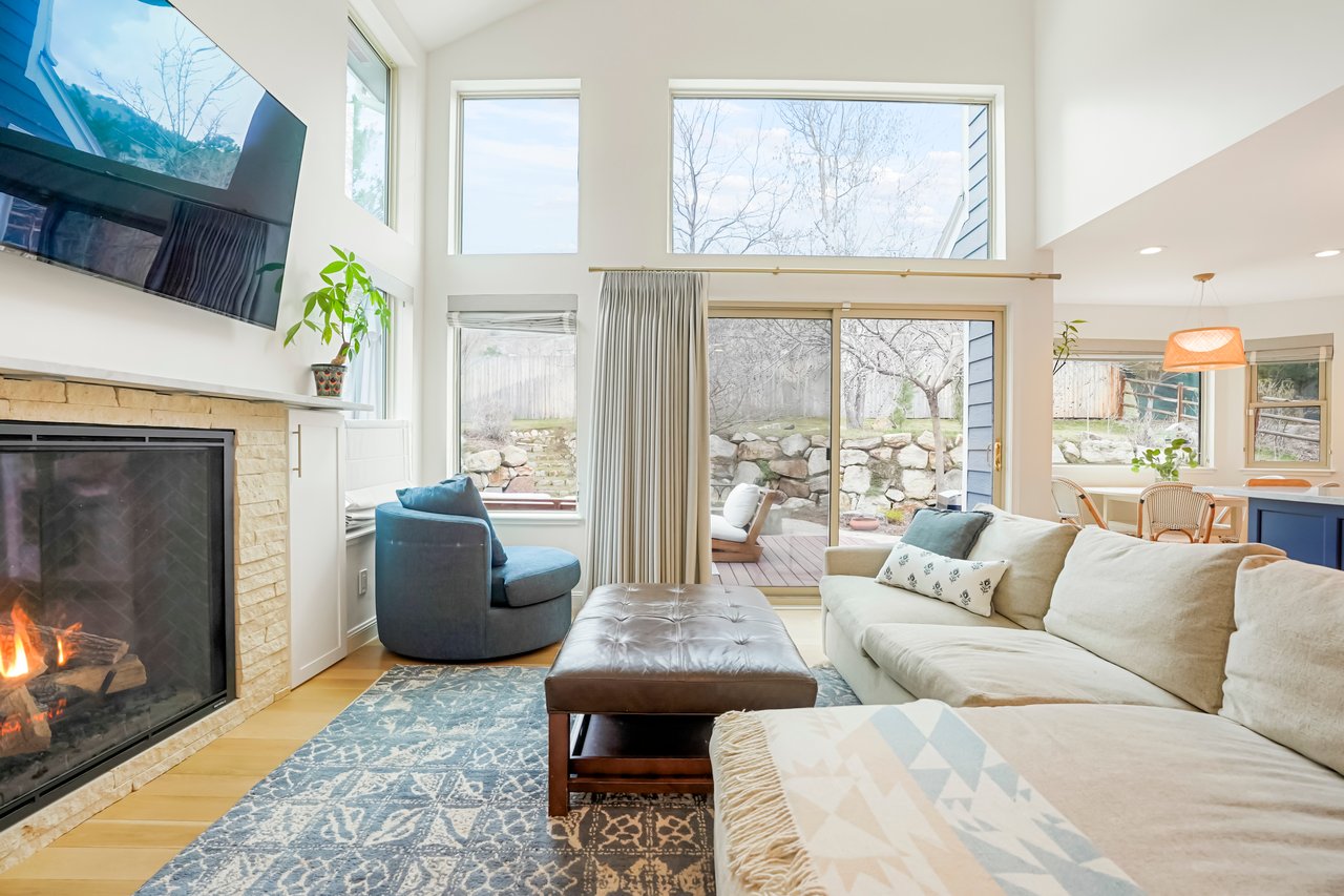
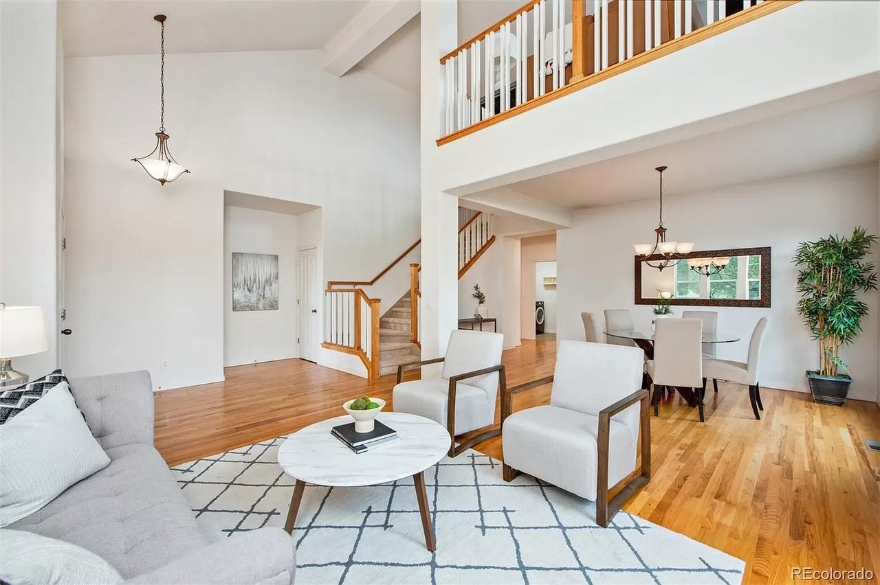
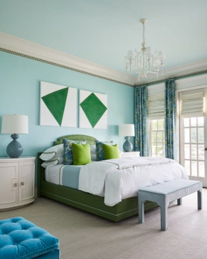
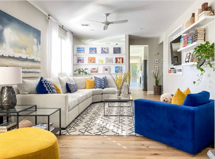
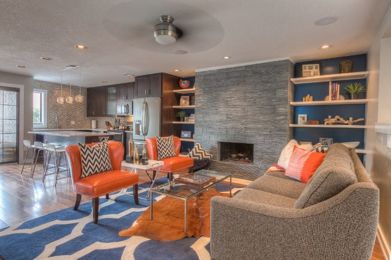
Accent colors can change from room to room, but continuing one consistent color throughout the home can help create a sense of continuity. “Let’s say you have green and blue in your living room,” Porter says. “Perhaps for the dining room, you use one of those two colors, maybe just the blue. Or you could do blue and yellow. So the blue is what will tie those rooms together.”
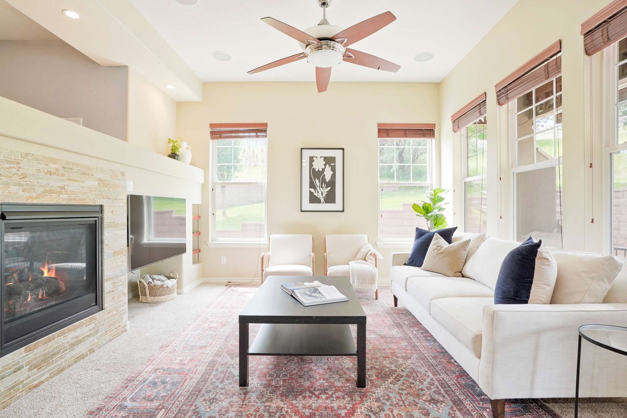
The two rooms pictured in this photo and the previous one are from the same home and illustrate this principle. In the first photo green and blue are the main accent colors and white is the wall color; in this photo the blue and green carries through to this family room. The effect is cohesive but not repetitious.
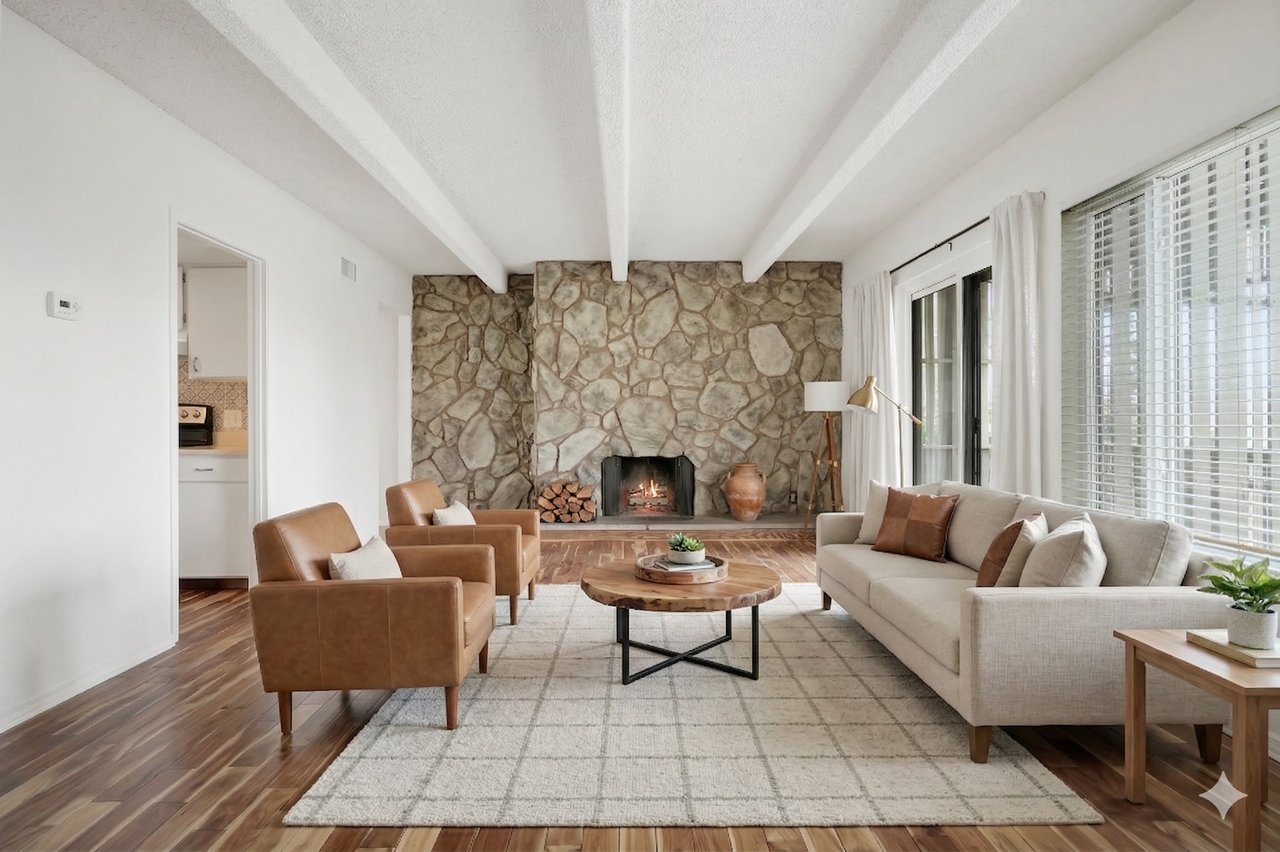
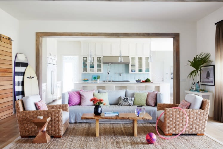
7. Use the 60-30-10 Formula
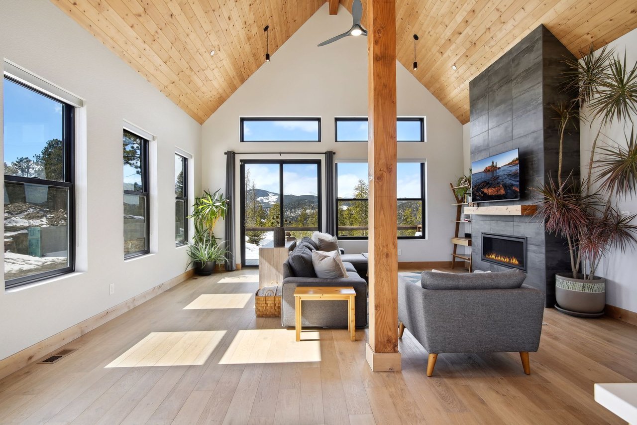
Another way to create a cohesive flow from room to room is to think of the palette for your home as a math problem. “Use a base color that you really like as 60% to 70% of what you’re going to paint for your interior,” Wardlaw says. “Your next color needs to be 25% to 30%. Then you can do your accents of 5% to 10%.”
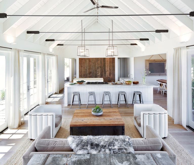
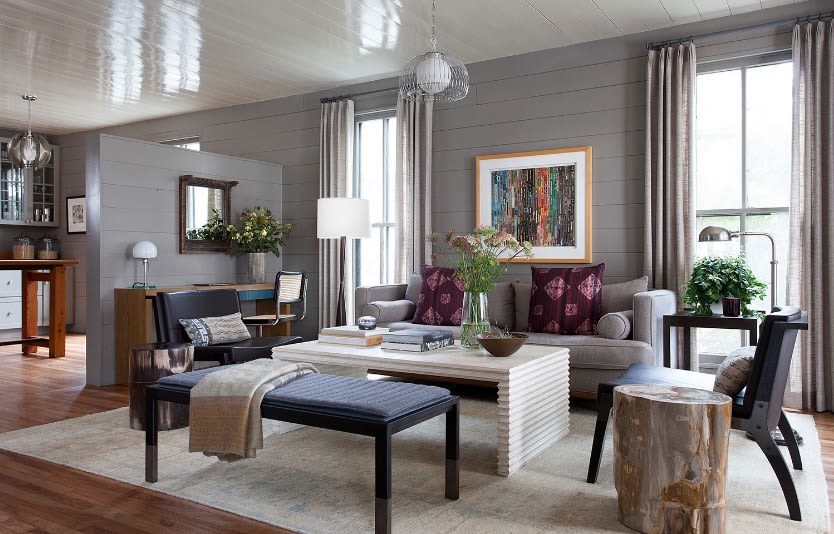
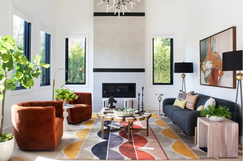
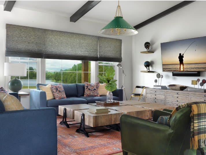
In this photo, which shows one of Wardlaw’s designs, gray is the 60% color, blue the 25%, orange about 10% and brown maybe another 5%. “I really try to make people only go with about three colors, four at the max — at least on the interior,” Wardlaw says. “Otherwise it just feels chaotic.”
To pull the colors throughout the home, you might use a variation on the scheme in an adjacent dining room. The walls might be painted blue, and perhaps gray could be used as an accent, with a few small orange accessories providing the 10 percent dose of color. “As long as you keep it cohesive throughout your entire home, it’s going to make more sense,” Wardlaw says.
8. Consider Using Color-Planning Tools
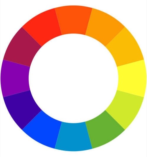
Those who love delving deeper into design principles may want to read up a bit on color theory — or at least ask your interior designer about it. “One of the main things I explain to my client is the color wheel,” Wardlaw says. “To keep that cohesive feel throughout your home, one of the main things you can do is consult that.”
A basic rule of thumb is that using analogous (or adjacent) colors on the wheel will create less contrast and a more calm feel, while choosing complementary colors (across from one another on the wheel) will create greater contrast and a higher-energy room. Understanding the relationships between colors will help you see why certain combinations have certain effects on you.
For a Well-Designed Look, Hire an Expert
Designers have studied color and can offer invaluable guidance when you’re decorating or remodeling. You can hire one to take your project from start to finish, or simply as a consultant to troubleshoot a specific area like tweaking your home’s palette so that the colors flow well throughout your home.
Porter, who does a lot of color consultations, says her clients tend to know what color they want to use but need validation that the shade they are considering will produce the desired effect. She did a long-distance consultation with a client who passionately loves orange. “The colors she was telling me about were very bright and childlike,” Porter says. The designer suggested a more adult rusty orange instead. “She tried it and loved it,” Porter says.
Source: Houzz