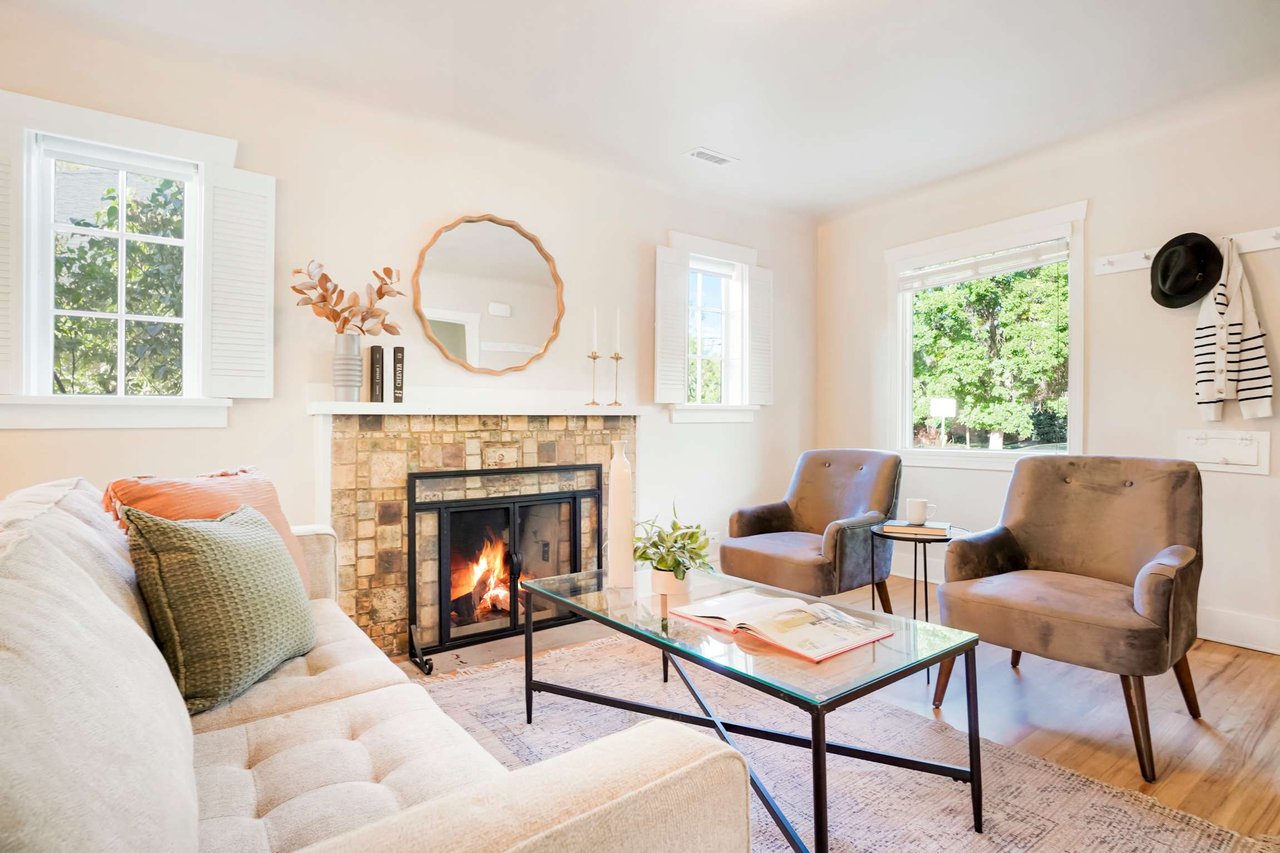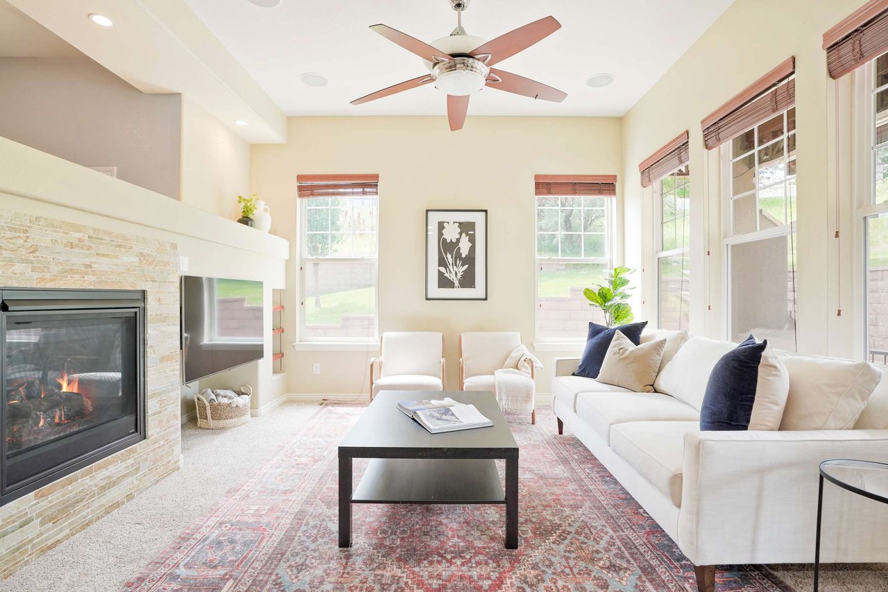
Encourage relaxation with these paint color recommendations ranging from subtle neutrals to blue-green hues.
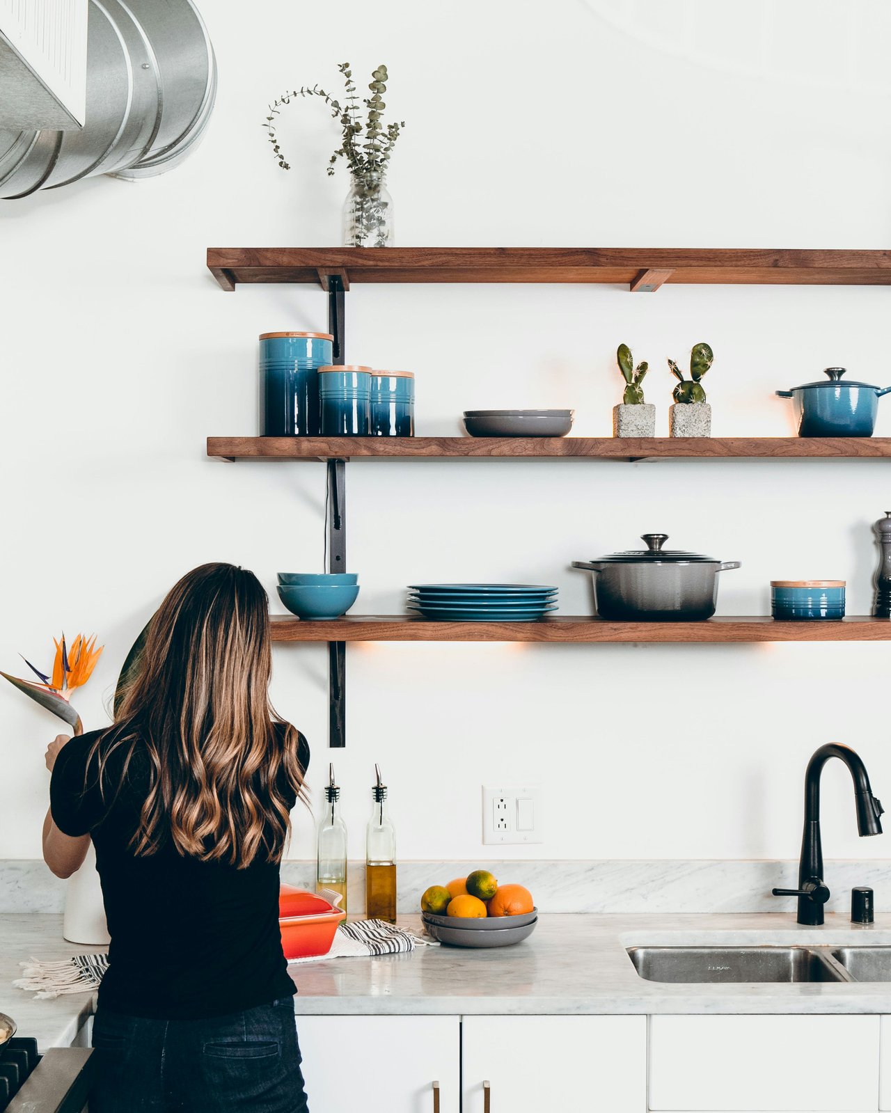
Soft blues and restful shades of white aren't just for your Zen den—they're also suitable for kitchens, laundry rooms, and even large living areas. All it takes is a little inspiration and a handful of tried-and-true color recommendations from interior designers and paint pros. Read on for relaxing color palettes that will make every room in your home feel like a blissful escape.
Tips for Choosing Soothing Paint Color
With so many options, selecting a calming paint color can be a daunting task. Sue Wadden, director of color marketing at Sherwin-Williams, suggests looking inward before getting started. "Color can help shape our day-to-day environments and impact our mood," she says. "So when selecting colors, people should think about how they want the space to make them feel and let their emotions guide their decisions."
Wadden suggests veering towards calming blues and greens, which she describes as "soothing and grounding colors that encourage wellbeing." Soft neutrals can also encourage relaxation, and she suggests whites, creams, beiges, and lighter gray as soothing backdrops.
The founder of Clare Paint, Nicole Gibbons, also turns to blues and neutrals to create a relaxing atmosphere. "I love using serene, understated blue and neutral shades to create a sense of instant calm in a space," she says. "Blue-greens and soft grays can feel especially tranquil and instantly put you at ease."
Favorite Blue-Green Paint Colors
Blends of blue and green draw on nature's relaxing properties. Gibbons has two go-to shades she recommends for relaxing spaces, and they're both hazy and ethereal.
Chill and Headspace by Clare Paint
The first is Chill by Clare Paint and it's sure to help you mellow out. It's a "soft, cool, barely-there gray with a slightly green undertone," says Gibbons. "It's light, airy, and calming: an excellent antidote to a long day." Gibbons also loves Headspace by Clare Paint, which she says is a universal favorite. She describes it as a "soft and airy blue-green hue" that creates a serene atmosphere in any room.
Sea Salt by Sherwin-Williams
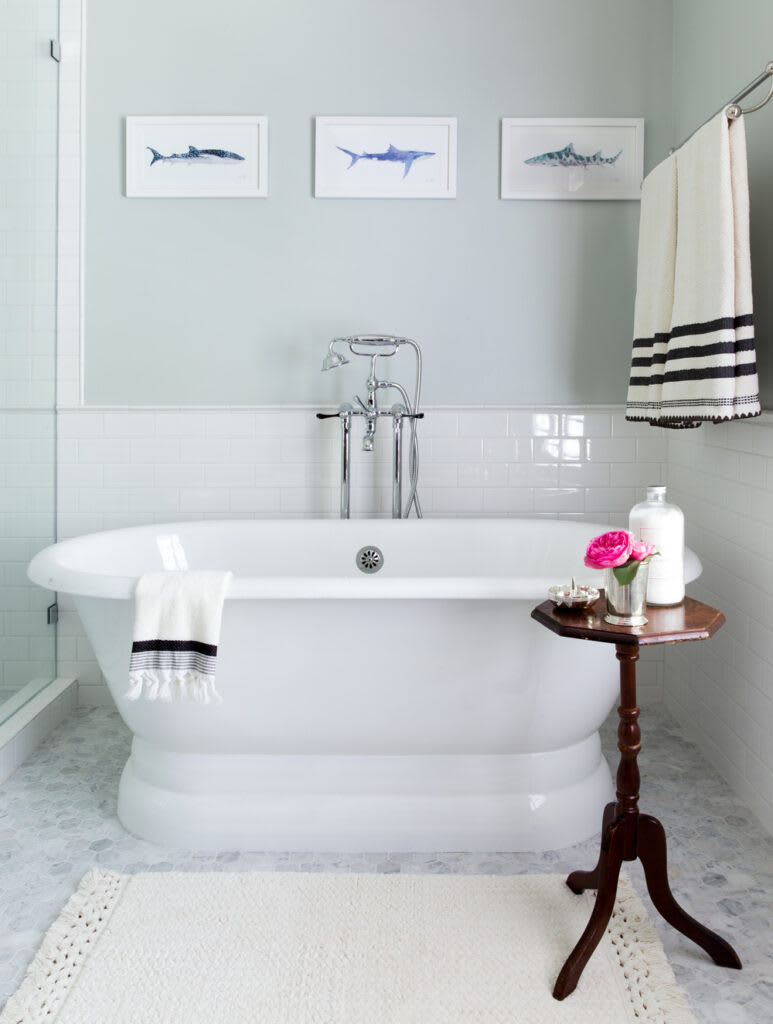
Sherwin Williams's popular color, Sea Salt, is another reliable blue-green favorite. Houston-based interior designer Jennifer Barron says it's the ideal bathroom color. "The soft green undertone creates an ethereal feeling that is perfect for soaking in a bath and relaxing," she adds.
Peaceful Neutral Paint Colors
If you're looking for a neutral wall color that mixes well with serene blue and green decor, try these complementary shades of cream, white, and beige.
Feather Down OC-6 by Benjamin Moore
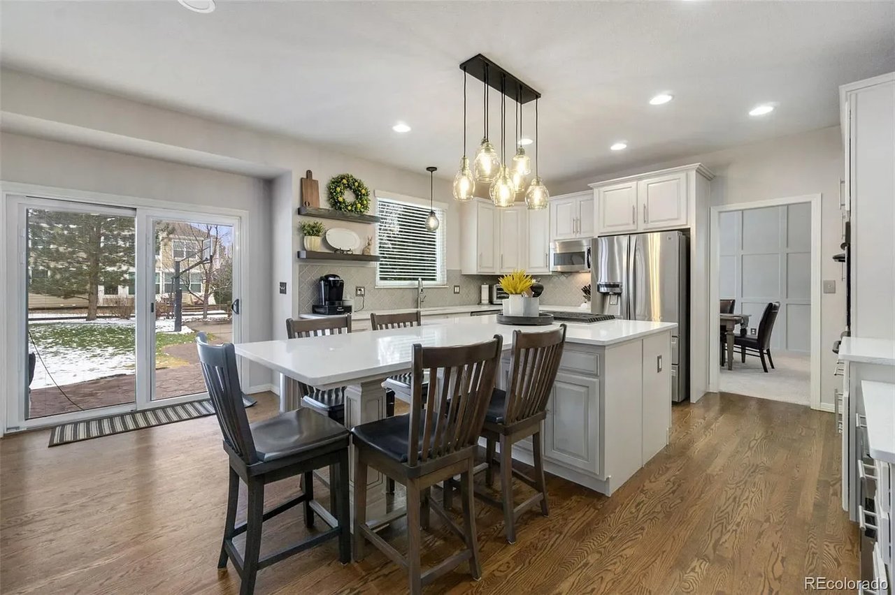
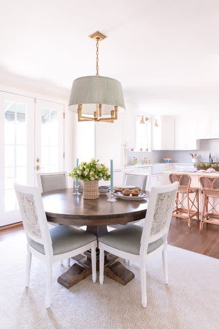
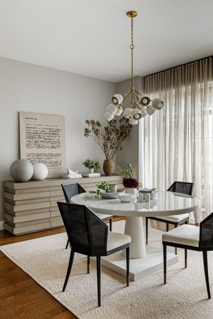
Nashville interior designer Katie Gibson loves Benjamin Moore's Feather Down OC-6. "It is a perfect neutral, not too dark but not stark white," she says. It's a reliably relaxing choice for large, open-concept living spaces with a central dining room and kitchen.
Drop Cloth by Farrow & Ball
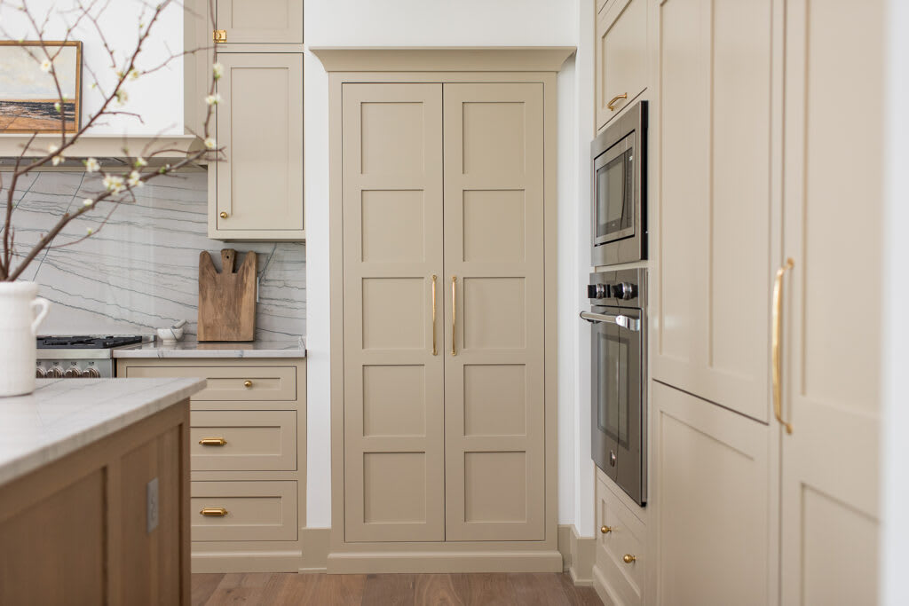
If you love a warm, natural aesthetic, try using an earthy taupe on kitchen cabinetry and you'll feel at ease in the busiest room in the house. Indianapolis-based interior designer Whittney Parkinson featured Farrow & Ball's Drop Cloth in a space that lacked ample natural light. She wanted to create a warm environment without using bright whites, and taupe did the trick. "Drop Cloth has this perfect balance of warm and cool," she says, explaining that it looks different depending on the time of day. "The intent was for this kitchen to feel natural and calming, with a nod to its European roots."

Cloud White by Benjamin Moore
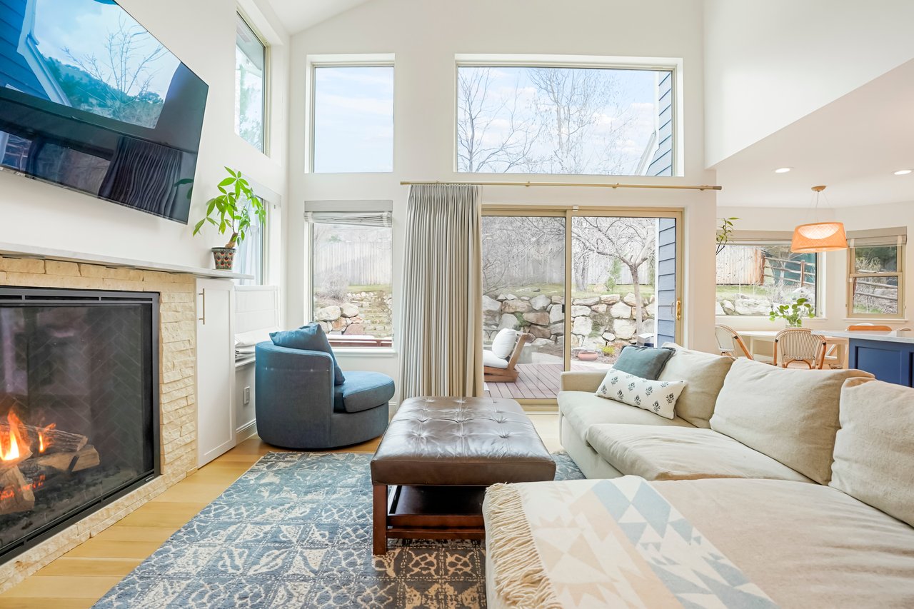
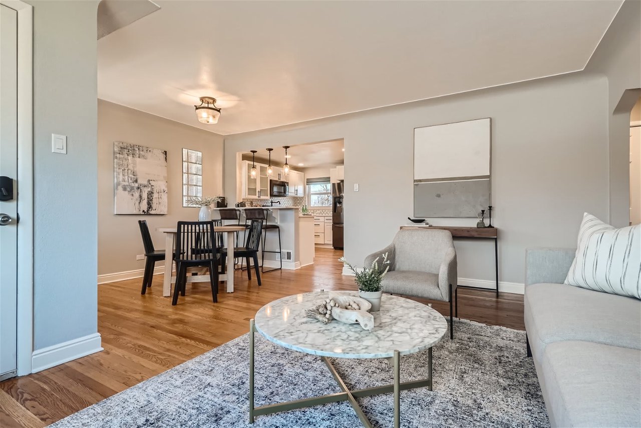
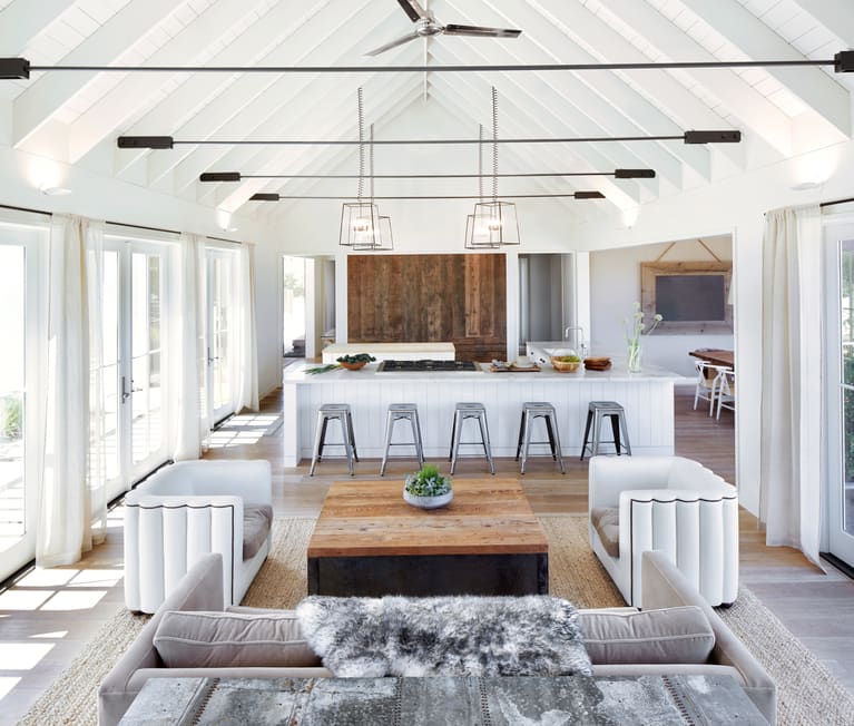
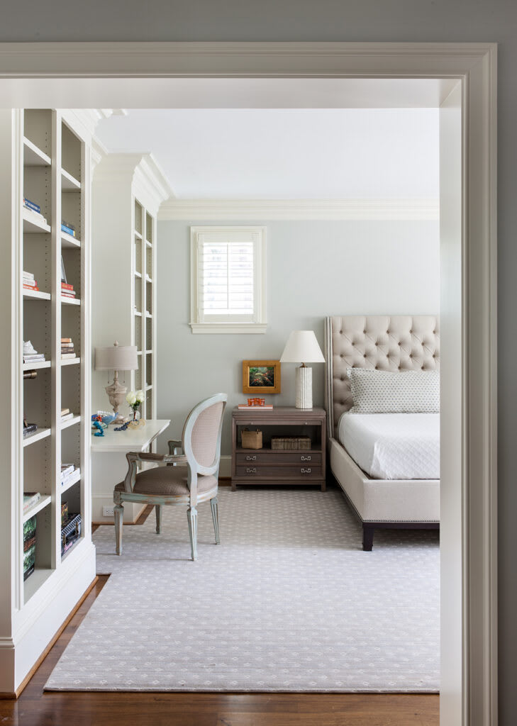
If you prefer a more modern, transitional aesthetic, interior designer Marie Flanigan recommends Benjamin Moore's Cloud White. "It is one of my most consistently used paint colors, and it never disappoints," she says. "It may be a white paint, but I find it brings warmth and depth to any room." This guest house project was designed to bring tranquility to visitors the moment they step through the door.
Barely-There Blue Paint Colors
When it comes to light blues, often the shade you fall in love with on the paint chip is not what you end up seeing on the wall. But if you know what to expect from the outset, you can pick a shade of light blue that's both reliable and relaxing.
Gray Owl by Benjamin Moore
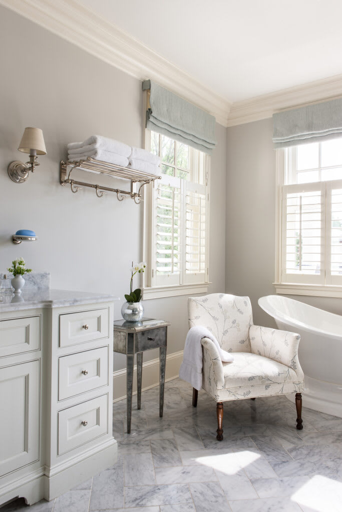
Here's one color you can always count on. While Benjamin Moore's Gray Owl looks gray on a small sample, it reads barely blue on walls, making it a pretty choice for spaces with both gray and blue in its color scheme. Interior designer Marika Meyer often recommends the shade to clients. "This particular paint color is perfect for those looking for a calming color to pair with marble, as it is a gray paint with blue undertones," she says.
Iceberg by Benjamin Moore
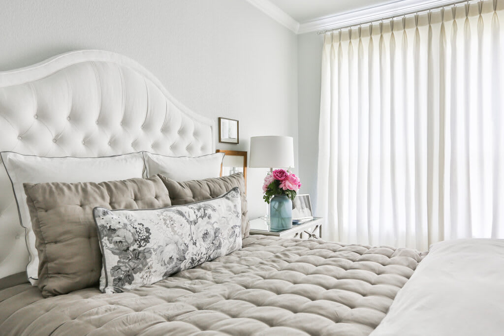
Benjamin Moore's Iceberg is another favorite of Meyer's for master bedrooms. "It's my number one choice when people tell me they are looking for a calm and soothing shade of blue," she says. "It's both serene and crisp at the same time."
Oyster Shell by Benjamin Moore
If you're looking for a peaceful, barely-there blue that almost disappears on the wall, turn to Benjamin Moore's Oyster Shell. It's a favorite of designer Shannon Crain of Houston, TX, who says it "feels like a cloud" and has an instant soothing effect. "I love to use it in master bedrooms, so it feels like a retreat for my clients," she says.
Lookout Point by Benjamin Moore
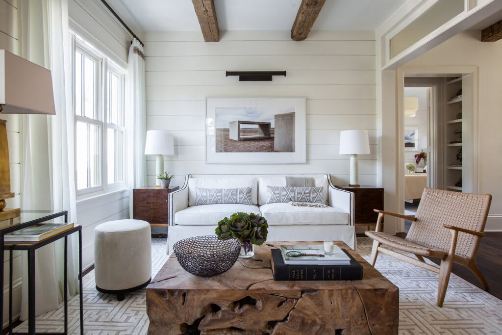
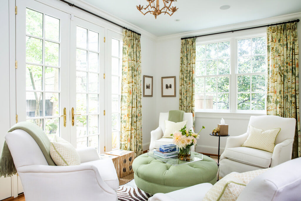
Classic white walls can be a relaxing choice on their own, but Washington, D.C.-based designer Anna Matthews took things a step further by adding Benjamin Moore's Lookout Point to the ceiling of this zen living room. "Painting a soft blue on the ceiling of this sitting room brings such warmth," she says. "It created a sense of coziness and allowed the gilded chandelier to really pop." The color balances fresh shades of green on the furnishings, and ties in with the drapery pattern to bring the room together.
Restful Gray Paint Colors
Don't forget about gray! It might seem gloomy, but the shades of gray, especially those with warm undertones, can ground a room. Gibbons suggests using it on cabinetry coupled with crisp, white walls, though it also fits well in kitchens, laundry rooms, and living areas.
Seize the Gray by Clare Paint
Gibbons suggests Clare Paint's Seize the Gray, one of the company's most popular colors, for a soothing shade of gray. "In the spirit of feeling clean and fresh, it's our most neutral light gray with no undertones," she says.
Pavilion Gray by Farrow & Ball
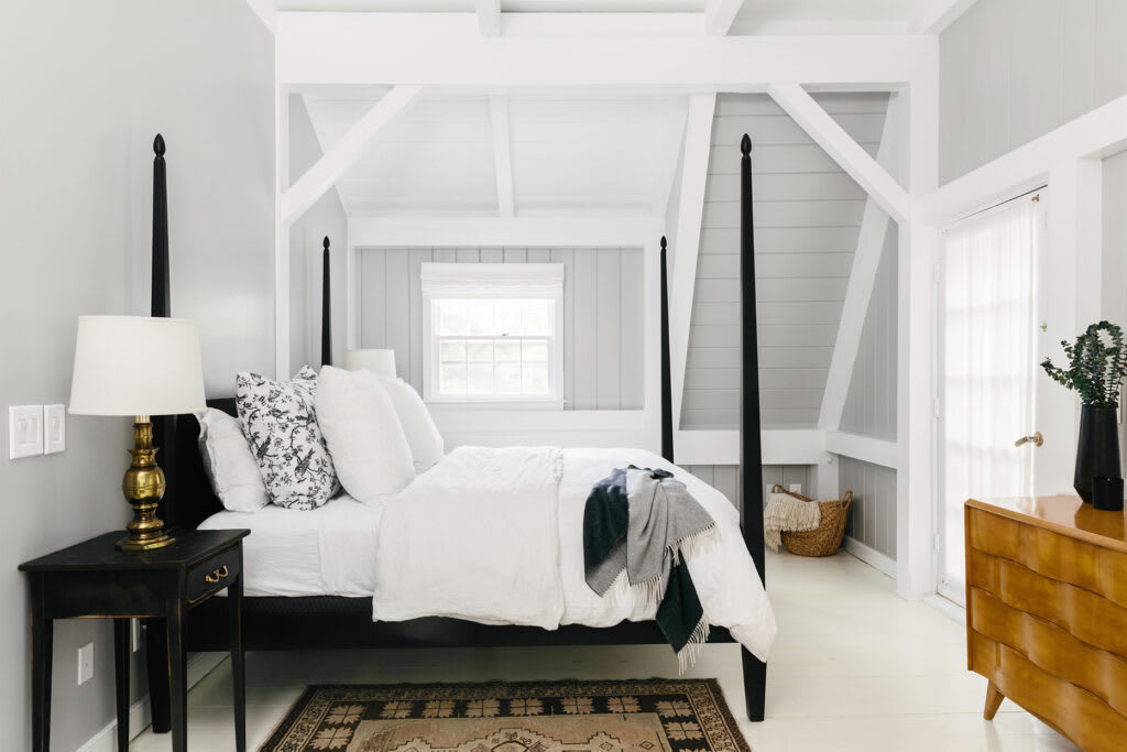
For fostering tranquility, New York interior designer Shelly Lynch-Sparks of Hyphen & Co. prefers gray in a bedroom. Her go-to choice: Farrow & Ball's Pavilion Gray. She describes this color as warm and sophisticated and says it makes her feel "completely serene."
London Fog 1541 by Benjamin Moore
Designer Becky Shea recommends Benjamin Moore's London Fog 1541 for open, modern living spaces. Shea says this reliable color has become her go-to recommendation for clients, particularly for living rooms and dining rooms.
"It has a soft, tonal sheen that is simultaneously warm and inviting; it's the perfect layer to bring a neutral palette together," she says. "This color makes you feel calm, refreshed, comfortable, and laid back when you're in the room. I'm sure it's a combination of all the elements living in harmony, but the paint color seems to always draw people's eye!"
Vibrant Blue Paint Colors
While it might seem counterintuitive, bolder paint color options can also be restful when used universally.
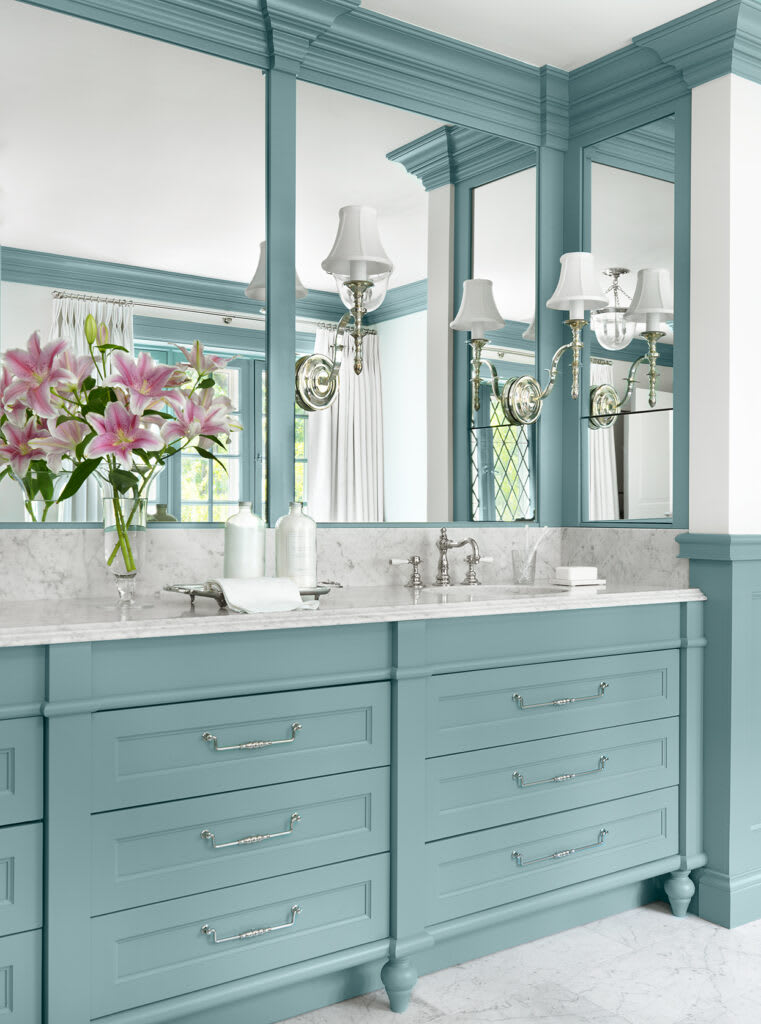
Oval Room Blue by Farrow & Ball
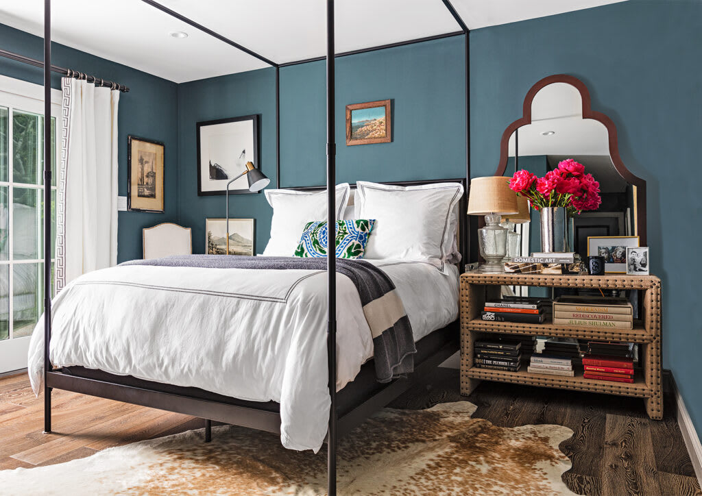
Take Farrow & Ball's Oval Room Blue, for example, which was recommended by two designers independently. Designer Amy Studebaker of St. Louis, MO, used it in a client's master bathroom as a trim and custom cabinetry color. Pair dark trim with a light wall color for pleasing contrast. "The undertone of this particular blue is very rich and practically begs you to come in and relax," she says. Interior designer Jennifer Barron suggests the shade as a serene bedroom color that envelops guests and creates a relaxing atmosphere.
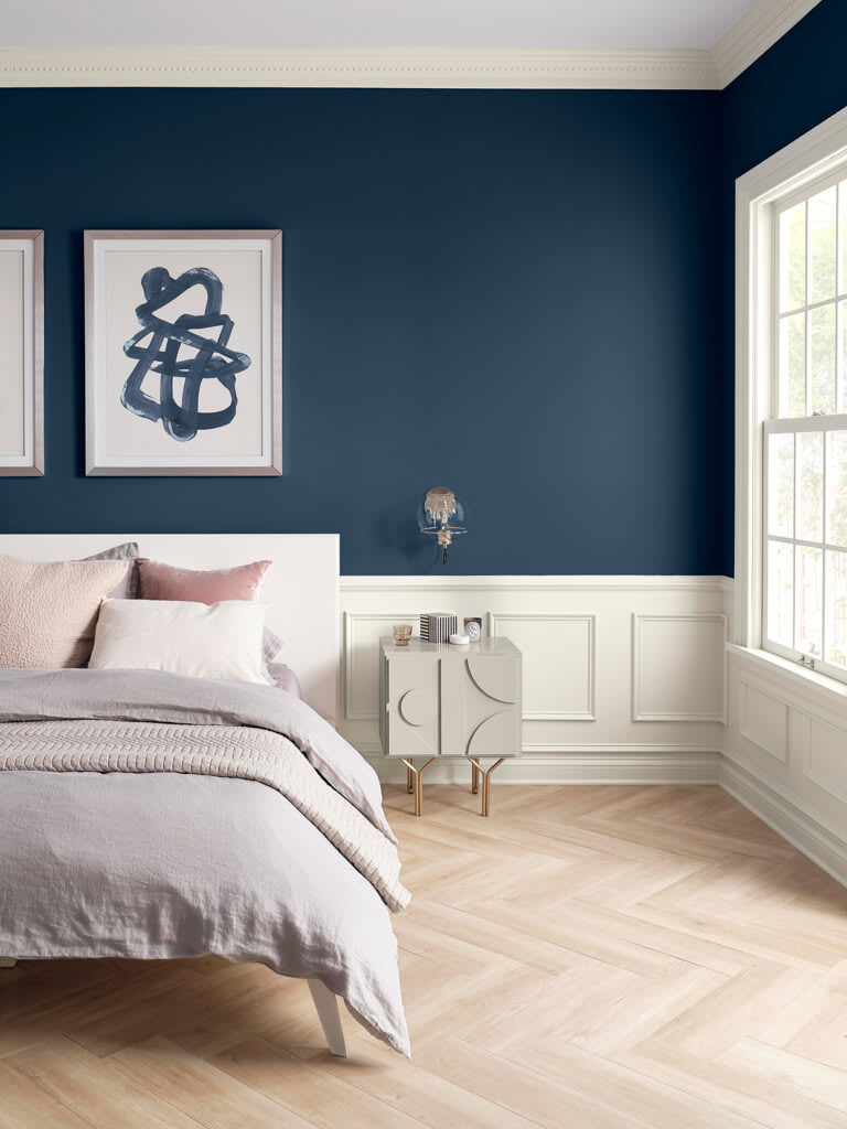
Naval SW 6244 by Sherwin-Williams
If you're looking for an unexpected color choice, Wadden says committing to a bold color like an ink-well navy can foster relaxation. "Our 2020 color of the year, Naval SW 6244, is a deep navy hue that is surprisingly both bold and soothing," she says. "Naval is tied to the seas and the skies, making it an incredibly grounding color. Whether it's on one wall, all four, or the ceiling, too, it creates a fully enveloping effect."
Must-Know Tips Before You Start Painting
Once you've gathered your top three choices, it's important to test paint colors in person. While nearly all colors look beautiful on paint chips or online, the undertones and color complexities can change dramatically depending on the amount of natural light available, the direction of the room, and even the time of day.
An easy way to test paint colors is to sample them on multiple walls of the same room to ensure you like it in the shade, full sun, and even in the room's niches and corners. Does the color stay the same against the existing trim color? These are all important concepts to think through prior to buying cans and rollers.
If you're still not sold on a single shade, start eliminating options by rolling samples on poster board pieces (rather than the wall) and moving them around the room throughout the day. To make the process even easier, consider ordering large, stick-on sample squares that can be peeled off afterward.
Source: Better Homes & Garden